Design Systems for Growing Teams
14 Aug 2026 · Design Systems · Series A · Series B · Scaleup
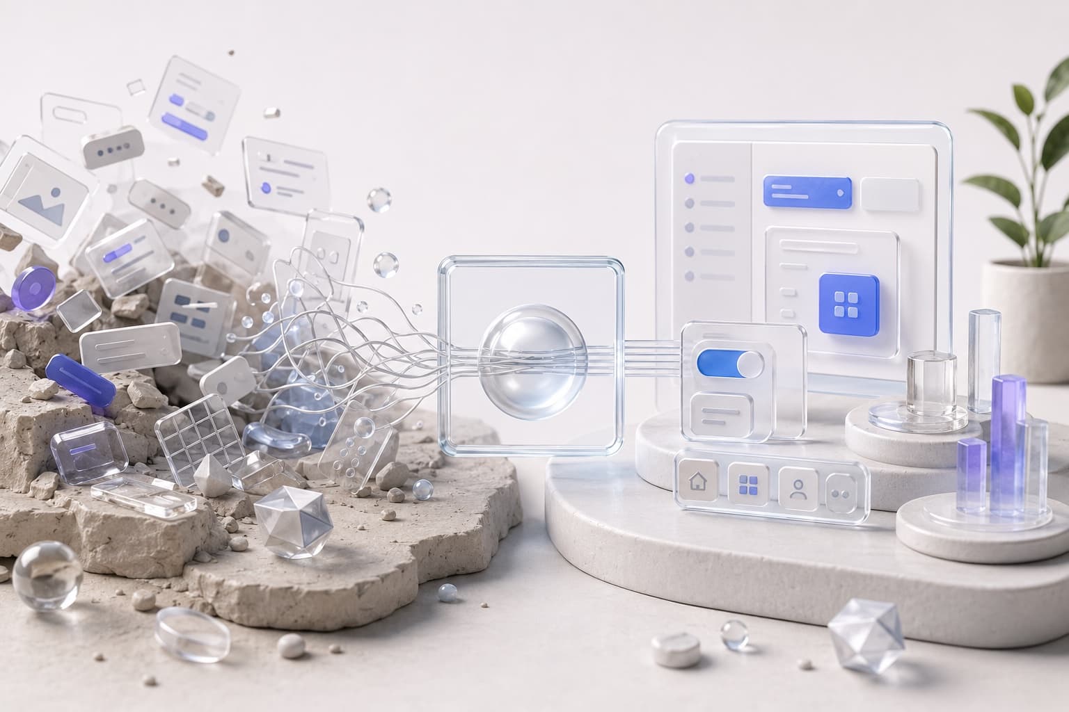
For Series A and B teams that have outgrown “just Figma it.” How a design system helps you ship faster, stay consistent, and stop product chaos becoming the culture.
At seed, inconsistency is a rounding error. One designer. One engineer. One product in their heads.
At Series A and B it becomes the culture. Three squads, two agencies in the history, a Figma file named Final-v7, and a component that exists in four slightly different paddings because nobody wanted to wait for the “real” button.
That is product chaos. It does not look dramatic in a board pack. It looks like every new screen taking too long, every review arguing taste, and customers feeling like they are using four products that share a logo.
A design system, done properly, is how a growing team moves faster and stays consistent — not by adding process, but by deciding the patterns once so the next fifty screens do not have to.
I help scaleups build that foundation: the tokens, components, language, and rules that let product and engineering ship without inventing the interface every Tuesday. Strategy and pixels. Enough code that the system is real, not a slide.
A design system is not a Figma library you never open
Most “design systems” fail in the same way MVPs fail. They become a smaller version of everything, documented, and unused.
A sticker sheet of buttons is not a system. A 200-page brand PDF is not a system. A Storybook that lags the product by a quarter is a museum.
The job is operational:
- The same decision does not get re-litigated in every PR
- A new hire can ship something that looks like it belongs
- Design and engineering are pointing at the same object, not a screenshot
- The core journeys stay recognisable as the surface area grows
If the library cannot survive contact with a sprint, it is decoration. Product design for startups is the wider arc. This page is the Series A/B failure mode: the product works, and that is now the problem.
Why growing teams feel slow
Speed dies in the gaps.
Design explores in one file. Engineering has a different button. Brand has a third. PM writes “make it consistent” in the ticket with no source of truth. Review becomes taste. Taste becomes delay. Delay becomes a one-off that will be copied forever.
You also get shadow systems:
- A “temporary” modal that became the pattern
- A data table each squad forked
- Empty states that only exist on the screens someone cared about
- AI features that look like a different company because they shipped last
None of this is a talent problem. It is what happens when the team grew faster than the shared language.
A design system is that language — visual, interaction, and product — made explicit enough to reuse.
What to put in the system (and what to leave out)
Start from the product you already have, not from a template called Atomic.
I usually want, in this order:
Foundations that cannot drift. Colour, type, space, radius, elevation. Named. Used. If two screens disagree on a number, the token is missing or ignored.
A small set of components that do real work. Button, input, select, dialog, toast, table, empty and error states. Not every icon in a tray. The ones people actually compose journeys from.
Patterns, not just parts. How you introduce a new object. How you ask for a destructive confirm. How an async job communicates. How AI output is labelled. Patterns are where consistency is felt.
Language. What you call the thing. If design says “workspace” and the product says “org” and support says “account,” the system is already lying.
Rules for contribution. Who can add. What “done” means (design + code + usage). How a one-off graduates or dies.
Leave out: a component for a screen that exists once, a theming engine you do not need, and a governance committee that meets more often than you ship.
The test is the same as an MVP. If it does not help the team learn or ship the next journey, it does not belong in v1 of the system. You can always grow a library. You cannot easily unteach four versions of a dropdown.
How this reduces chaos without slowing you down
A good system makes the default path the fast path.
- Design starts from what exists, so exploration is about the job, not the chrome
- Engineering does not rebuild a date picker because Figma was 4px off
- QA has something to check besides “looks fine to me”
- New squads do not fork the product in month one
- Reviews argue the decision, not the padding
That is how you move faster. Consistency is the side effect of fewer invented interfaces. Product chaos shrinks because there is a place the answer already lives.
It will not make a bad journey good. If the core flow is confusing, a prettier button will not save launch. Do the UX audit on the path that matters, then encode the result so the next squad cannot quietly undo it.
When you actually need one
Too early: you are still changing what the product is. A system will freeze guesses.
About right: more than one designer or more than one engineering squad is shipping into the same product; customers can feel the joins; you are about to hire, or you already hired, and the file cannot hold.
Too late: every squad has a private kit, and “consistency” is a Q4 initiative with no owner.
Series A is often the first honest moment. Series B is often the painful one. Either is cheaper than letting another year of one-offs become the product.
You do not need a platform team of eight. You need someone who can sit in the product, name the patterns, and put them in Figma and in code so the system is how work happens — not a parallel universe.
How I run this work
I do not disappear for six weeks and return with a kit.
We pick the journeys that are already causing collisions. We inventory what you actually use. We kill duplicates. We name what remains. We implement the pieces that are blocking speed this month. Then we set the rule for the next component so the library does not become a junk drawer.
Fractional, alongside your team. How I work still applies: cut the scope, make it real, follow evidence. A design system that nobody ships with is a failed prototype of process.
AI helps with the first pass — audit the file, cluster the variants, scaffold the tokens. I still decide what is in, what is a one-off, and what would make the product harder to use at the next stage of scale.
If the product is starting to feel like several products
That is the signal.
You do not need another visual refresh. You need a shared system so the team can move without multiplying chaos.
Start a conversation. Bring the Figma, the Storybook if it exists, and the screen everyone is afraid to touch. We will find the smallest system that makes the next fifty screens cheaper — and more like one product.